.avif)
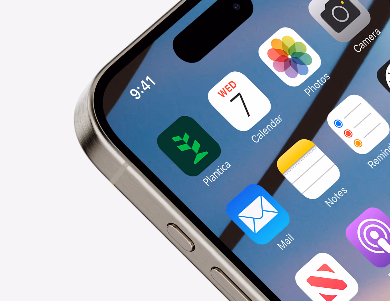
Branding Plantica
Engineering nature.
The Brief
Plantica makes greenhouses and tools for ecosystems that let you control the weather. The company needed a logo that could connect the natural and the man-made. The goal was to create a brand that looked technical but still warm, modern but not sterile, and always based on sustainability.
The Idea
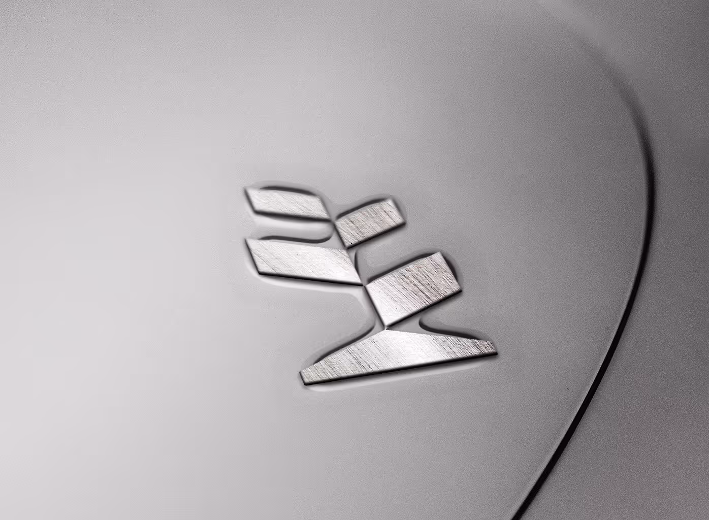
The design started with a question: what happens when structure and life share the same shape? The answer was a simple, symbolic form. A triangle represents the greenhouse roof, mirrored below as a root. Two angled shapes on the sides can be seen as both leaves and window panels. The mark sits between function and metaphor, creating a precise system that still feels alive.
The Process
The research started with a deep look into climate engineering, including airflow diagrams, plant propagation, and systems for controlling the environment. Early sketches explored how organic shapes could meet engineered lines. Over time, the design was simplified, moving from literal greenhouses to abstract geometry. The identity system followed the same idea, using a modular grid, structured typefaces, and a color palette inspired by soil, steel, and light. Every choice balanced the mechanical with the natural.

The Mark
What remained was a logo with quiet intelligence, able to suggest many ideas while staying unique. It looks like both architecture and an organism. Its simple shape hides complexity, and its geometry adds feeling. The logo works well at any size, from a drawing on a plan to a symbol on machinery. Its steady accuracy corresponds to the company’s balance of growth and control.

The Outcome
The result is an identity that makes Plantica logo easy to recognize and conceptually unique. The system works well through different mediums, from documents to digital outlets to environmental signs, tied together by clear geometry. The project came in second place at the Best Brand Awards in 2023.