Branding Systems7
A system built to adapt.
A System That Thinks
System7 makes systems that help businesses cut through confusion and act with purpose. The brand needed to show that it was clear and thoughtful. It had to look logical but still be friendly, and modern without being too mechanical. The result is a brand focused on insight.

The Mark Inside the Name
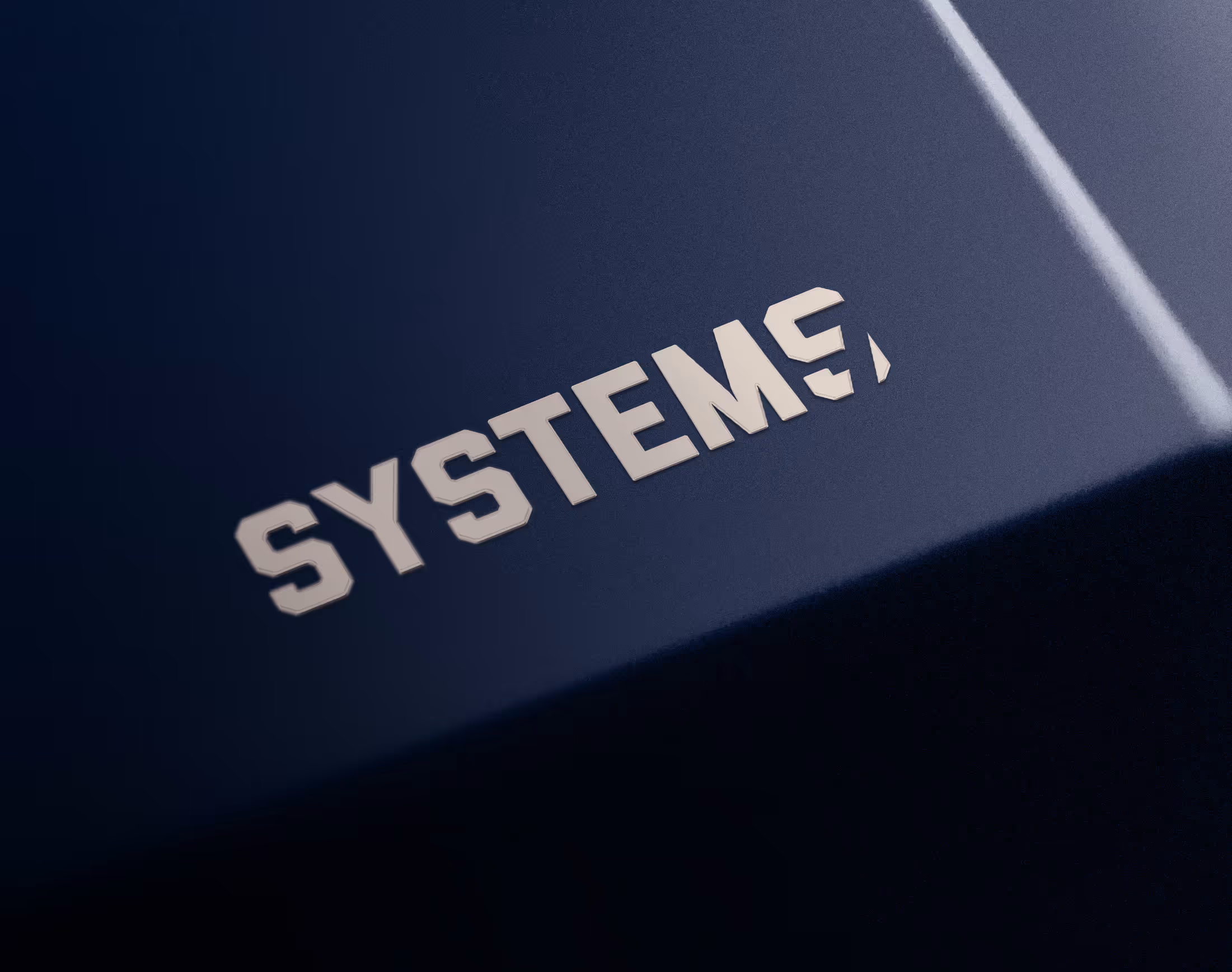
The concept began with the name. The last “s” in Systems turns into a “7” by highlighting what was already present, not by adding anything extra. This straightforward idea connects the company’s name, purpose, and philosophy in a single design. The shapes are simple, the layout is purposeful, and the bright blue color suggests intelligence and energy rather than the typical corporate calm. The design balances discipline and intuition, making the logotype feel like a tool for thinking.
Thinking in Form
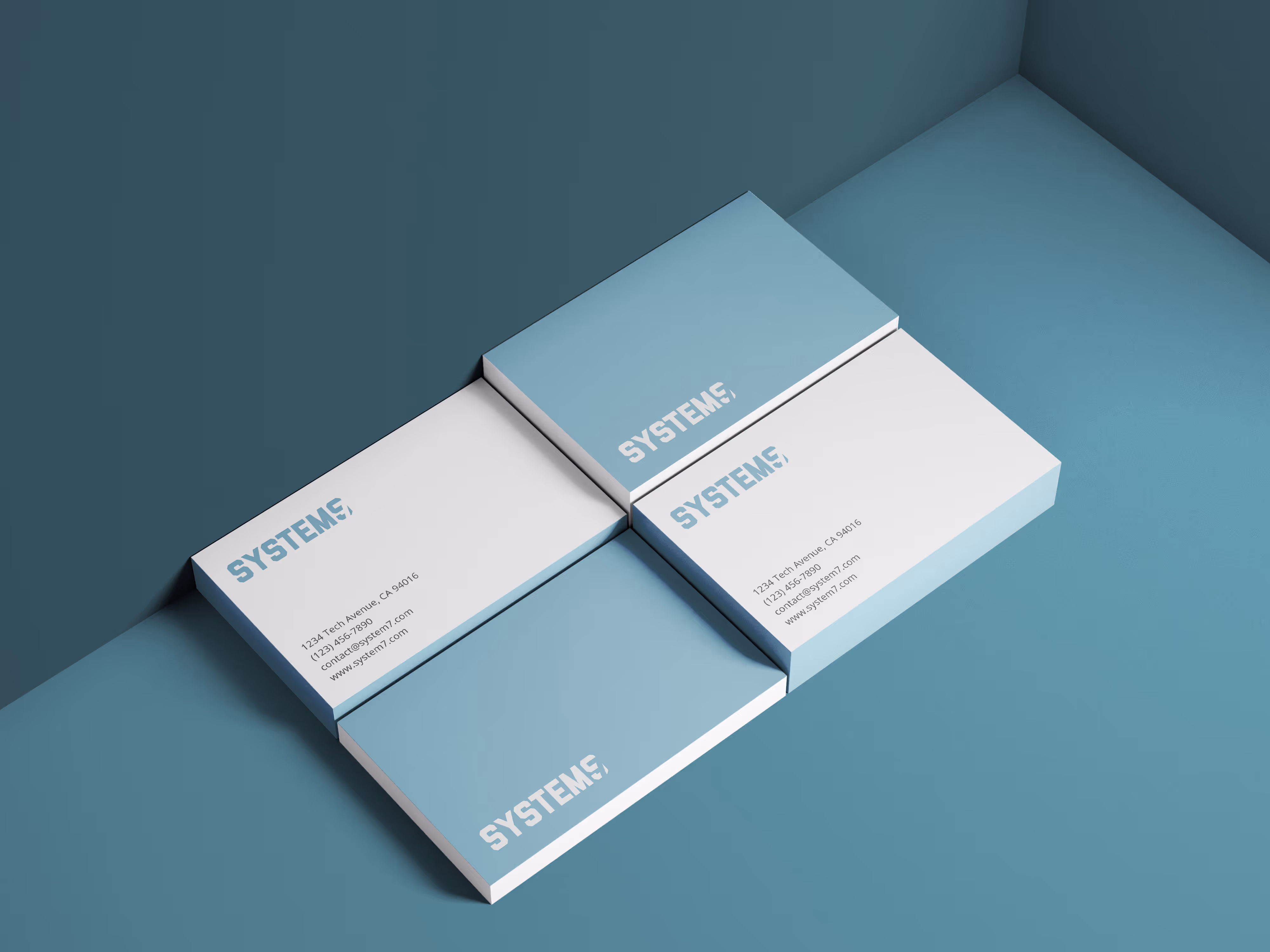
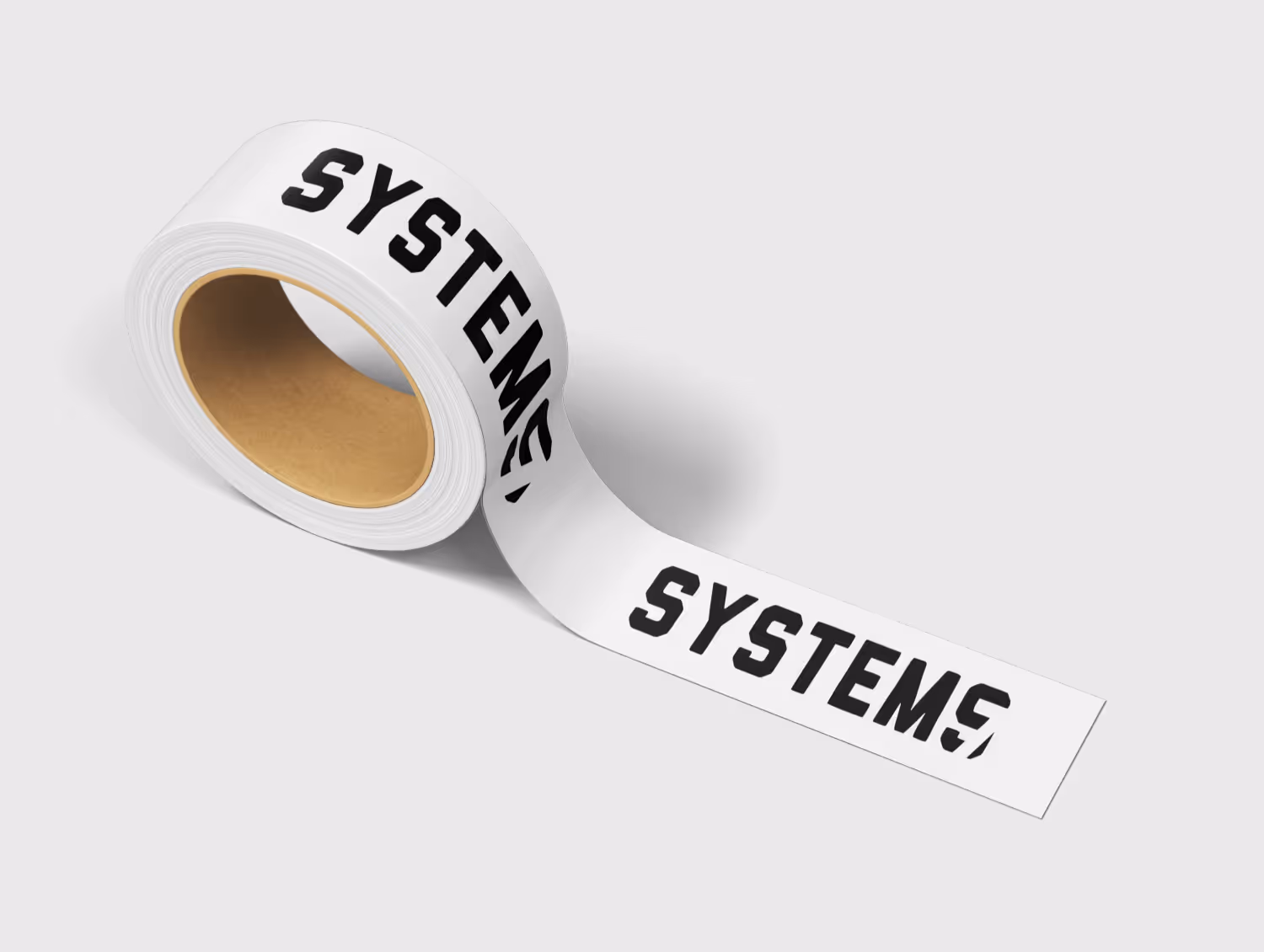
The final identity is both a process and a symbol. It works well across digital, print, and motion, acting more like a system than just a logo. Every decision supports the main goal: making complexity easy to understand. System7’s brand doesn’t just talk about innovation; it proves it by being precise, smart, and quietly confident.