.avif)
Bosanona
Gold Award Winner at TBBA 2026
The Brand
Bosanona is an online shop specialising in barefoot shoes for kids, inspired by the idea of natural movement and healthy growth. The visual identity moves away from the artificial feel of regular children’s footwear brands and focuses on grounding and exploration. The brand appears natural and friendly for children while also communicating sustainability and foot health to parents.


The Logo Mark
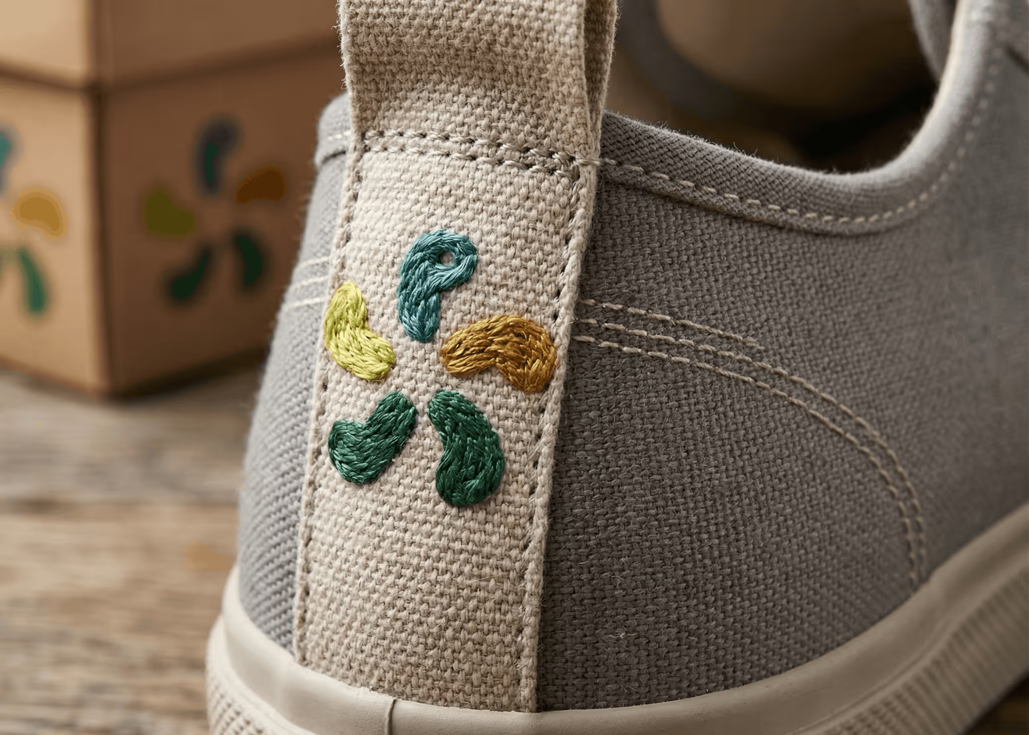
The main logo uses five footprint shapes arranged in a circle, similar to a pinwheel. This shows how a healthy foot spreads out and captures the joyful energy of children. A small circle in the top footprint turns it into a cheerful, simple character. This hidden figure adds a joyful detail and makes the logo feel like a friendly companion for kids.
An Earth-Driven Palette
The color palette is inspired by nature, using shades like teal, mustard, sage, and pear green to remind people of outdoor adventures. Instead of the typical bright neons found in kids’ products, these earthy tones support the focus on natural materials and healthy development. The palette works well both online and with our crayon-style textures.
.avif)
Balancing Play and Carefulness
We picked a mix of fonts to look both professional and playful. One font is rounded and lively, showing our brand’s personality. The other, DM Sans, is clear and easy to read, which helps parents find important details about foot support and flat soles. The overall style is bright and friendly for kids, but also trustworthy and polished for parents who care about their children’s foot care and sustainability.