Verda
Industrial UX: Designing for Environmental Constraints
The Challenge
The biggest UX challenge was making the system work well in tough conditions. Growers often work in humid areas with harsh lighting and usually wear thick nitrile gloves.
The old system was difficult to use because the tables were too crowded, making precise clicking in the fields challenging.
The old system was difficult to use because the tables were too crowded, making precise clicking in the fields challenging.

.avif)
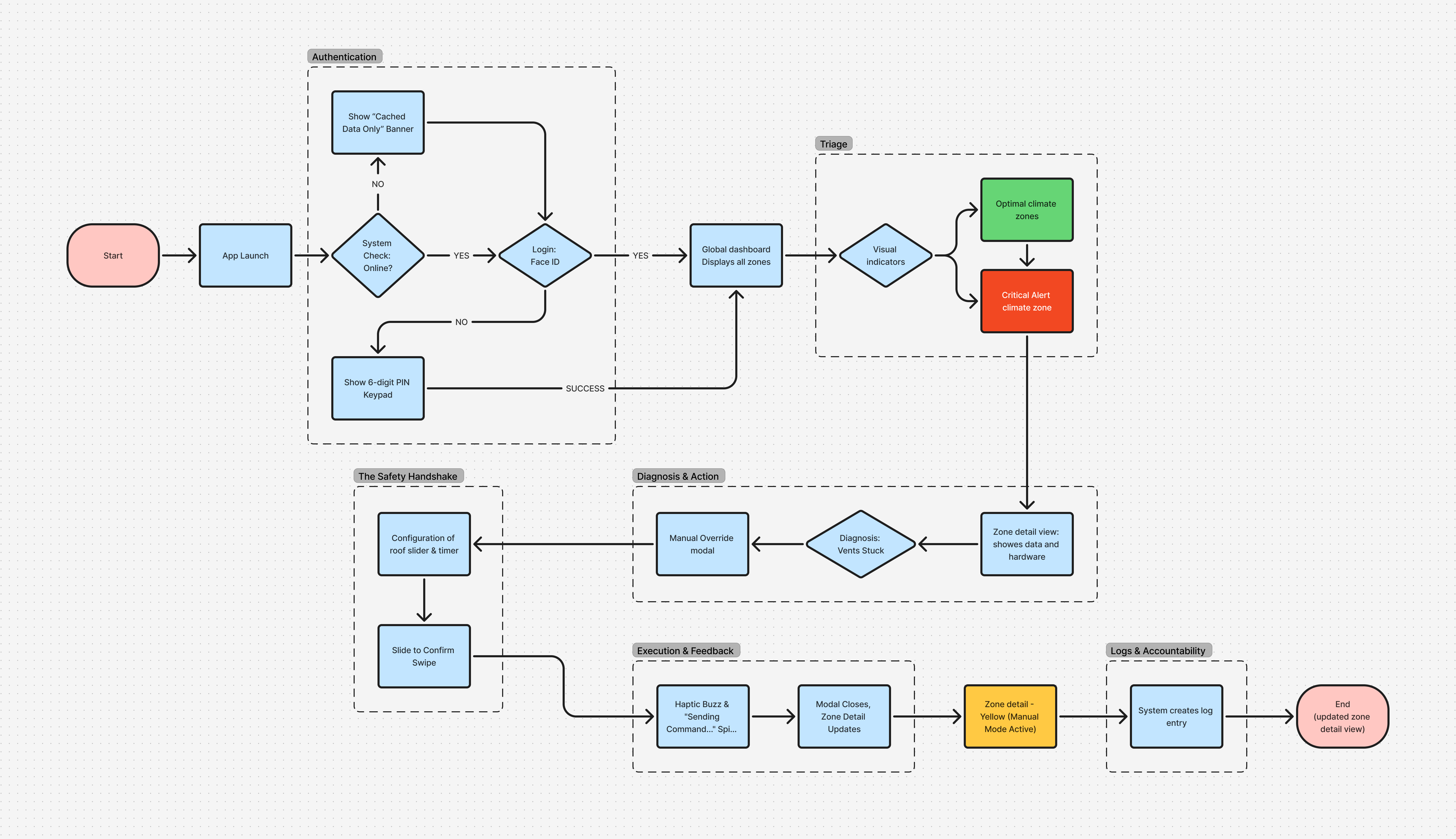
The Safety Loop Architecture
The app uses a step-by-step process called the "Safety Loop" to prevent users from receiving too many alerts. This breaks the user journey into three clear stages to help prevent mistakes:
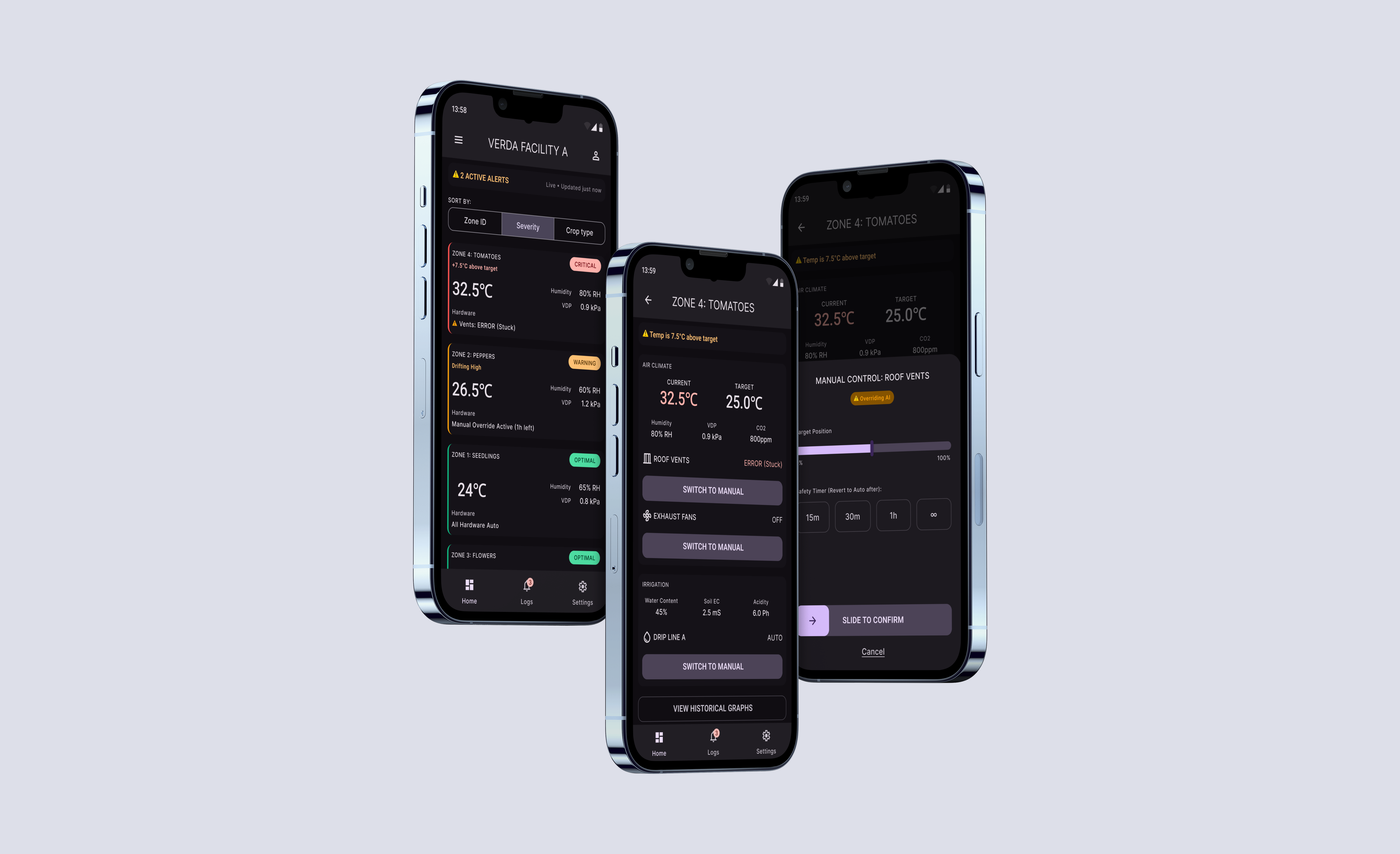
- Signal (View Layer): The dashboard uses high-contrast visuals to show system status so users can understand it at a glance without any interaction.
- Diagnosis (Context Layer): The Zone Detail view gives users comparative data to help them understand the alert.
- Intervention (Action Layer): The Override Modal is a separate area where users can change things in the system.
Keeping what users see separate from what they can change adds an extra level of safety. It makes sure that users think carefully before making any changes.
Ergonomics & Human Factors
The interface is built more like a sturdy control panel than a typical mobile app. The design choices reflect the way people use it and the challenging environment:
- Color Logic: To keep things clear, we used a strict color system. Red, amber, and green show biological status, while deep purple is only for system actions.
- Touch Targets: We made the buttons at least 64 pixels wide so that people wearing gloves can easily tap them.
- Readability: We chose the Barlow font for easy reading and resizing without disrupting layout, making information visible from a distance or in bright light.
.png)
.png)
Intentional Friction & Threshold of Intent
Most apps aim for a smooth experience, but in industrial settings, safety sometimes requires adding friction on purpose. Just tapping a button is not enough to show real intent for important controls.
For important actions, we used a "Resistance UI" pattern. Instead of tapping a button, users slide to confirm. This steady, intentional movement makes it hard to trigger by accident. The extra effort matches the seriousness of the action and helps prevent mistakes.
For important actions, we used a "Resistance UI" pattern. Instead of tapping a button, users slide to confirm. This steady, intentional movement makes it hard to trigger by accident. The extra effort matches the seriousness of the action and helps prevent mistakes.
.avif)
System Integrity & Adoption
Verda has evolved from a simple tool into a strong design system for automating agriculture.
- Error Prevention: Adding the "Slide-to-Confirm" pattern stopped accidental hardware triggers during user testing and the pilot release.
- Usability: By simplifying the layout, new users could learn the system quickly and use it confidently from the start.
This project shows that in industrial settings, clear design and setting limits are the best ways to support users.